
To be able to talk about the aesthetics of the Imperium of Mankind, we must first discuss how the narrative of the Warhammer 40.000 franchise is presented. We will divide the various narrative parts in to different levels. I will break down these narratives in the following structure:
1, rulebooks and expansions
2 Codexes
3 Novels
4 “Out of house” productions such as movies, card games, promotional materials etc.
The largest reason for this division is that it gives a much more flexible approach to analysing the different texts, as well as helping with the problem that some layers are considered more canonical than others. Canonical is here used to mean “what is real or true within the limitations of a fictional universe”.
In this part we will focus on the second level of the narrative structure. More specifically the way that the Imperium of mankind is presented visually both in writing and illustrations within their Codexes.
The decision to base this analysis solely on only the second level is partly because because I believe most readers comes in comes in contact with the Codexes first, as well as being the most consistent when it comes to tone and theme. This level is also under the tightest control of Games Workshop.
As the title suggests, I will in this text compare the visual aspects of the Imperium of Mankind to that of the Gothic aesthetic movement. Now, a disclaimer before continuing, my knowledge in this field is limited, so I apologize in advance for any errors that may occur.
In this chapter we will primary discuss the architecture of buildings, starships as well as war machines, and how they help to set a certain tone within the narrative, but first of all I would like to draw a parallel between the term Gothic, and the term for the two common human languages of the IoM, this being high and low Gothic. High Gothic being represented by a tongue and cheek take on Latin is presented as the language of the rich and learned. Low Gothic on the other hand is represented as English, and is the tongue of the commoner and uneducated (Hill, J.D 2016). Here we can see a clear nod to the Gothic movement.
Before we begin to discuss the visual aspect of the IoM, I will define what I mean with the term Gothic architecture. I will base my definition of the book Gothic architecture (Banner, R. 1961) In this text he outlines the history of the style, as well as a series of defining features. These features include spires, prominent buttresses and a focus on verticality and scale in the design. The architecture in many parts mimics that of medieval fortresses. High Gothic architecture in particular was meant to make the onlooker feel small and insignificant. Branner ends his book by describing the Gothic architectural movement in the following manner:
“Gothic was the final expression of the medieval world, of the concepts of a mystical cosmos and a transcendental universal religion” (Banner 1961)
Keep this description in mind as you continue to read this series. This definition will become quite striking when we have a more complete picture of how the Imperium of Man is being described. First we will take a quick look at some buildings of the Imperium of man.
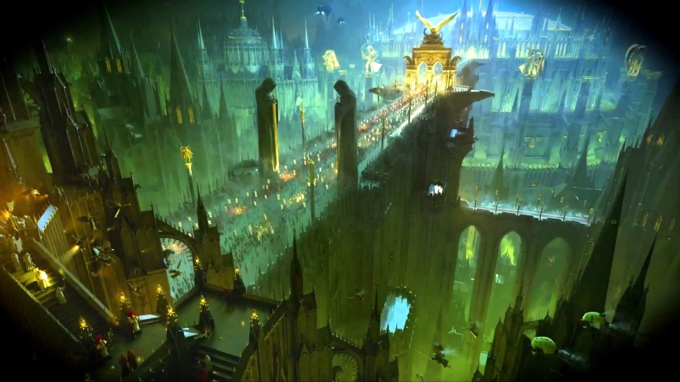
As you can see from the picture above, there are many of the aforementioned details such as large spires, prominent buttresses as well as an overall fortress-like design. Furthermore does the sensation of size and impression of grandeur permeate the works, making the humans next to buildings look miniscule and insignificant.

Source: warhammer40k.wikia.com/wiki/Battlefleet_Scarus
These design elements can also be seen on many of the Imperium s larger space ships. These designs can also be seen on many of the Imperiums larger space ships. These ships do not only include spires and buttresses, but also a notion of scale and a sense of a “larger than life” impression. These aesthetic elements can also be seen on many of the Imperium`s war machines such as the Imperial Titan, (a terrifyingly large walking gun platform used by some powerful Imperial officials), as well as the Imperiums more extravagant tanks.
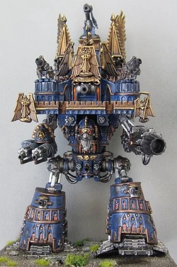
Source: http://warhammer40k.wikia.com/wiki/Titan

http://wh40k.lexicanum.com/wiki/Fortress_of_Arrogance
At this point most readers will have noticed the prevalent use of religious iconography, more specifically to the Christian catholic faith. The connection between Warhammer 40k and the catholic faith, can partly be explained by the fact that the company responsible for it series is based in Great Britain, a land with a history of Catholic faith, as well as grand Gothic architecture. I will discuss faith and religion in the Warhammer 40k franchise in a later chapter. Lastly I would like to draw the attention to how dark and imposing this architecture appears, with dark colours and imposing size. I believe that the use of Gothic architecture is meant to enhance the tone of oppression and horror in the narrative.
Next chapter we will continue to discuss this topic by taking a look at the Imperium use of technology.
References:
Branner, R. (1961). Gothic architecture. New York: George Braziller.
Hill, J.D. (2016). Astra militarum. Games Workshop. Lenton, Nottingham.
Copyright Disclaimer
Under section 107 of the Copyright Act 1976, allowance is made for “fair use” for purposes such as criticism, comment, news reporting, teaching, scholarship, education and research. I do not claim to own an of the pictures in this post. Al copyrighted materials belongs to their respective owners.
This blog post was spell checked and edited for readability at 2021-06-08

Most interesting and well written
LikeLiked by 1 person